I enjoyed Tim Lee’s post contrasting the density of various places he’s lived, so I’m reproducing the same for me below. I’ve used the same scale, but the maps are from OpenStreetMap, a very cool and good project that I hope to contribute to, or at least use and write about, more in the near future.
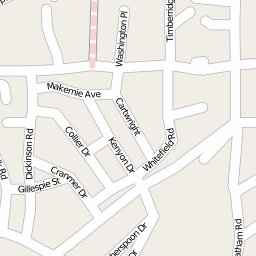
Knox Knolls (62704), an early (built 1960s?) subdivision on the west side of Springfield, Illinois:
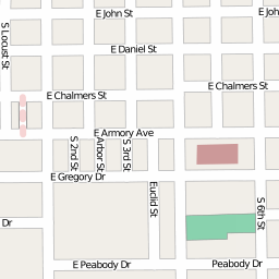
EastWest of the UIUC campus (68120), mostly student housing in Champaign, Illinois:
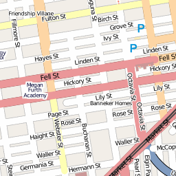
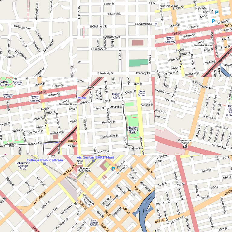
Sort-of (a block north would be definite) Hayes Valley (94102), mostly subdivided victorians and some later apartment buildings in San Francisco, California:
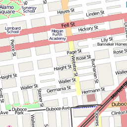
Lower Haight (94117), commercial hipster and crack addict district a few blocks southwest of previous in San Francisco, California:
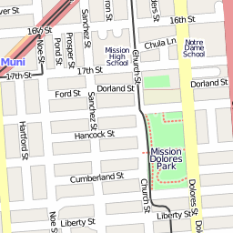
Far eastern block of the Castro (94114) before becoming the Mission, mostly subdivided victorians and some later apartment buildings in San Francisco, California:
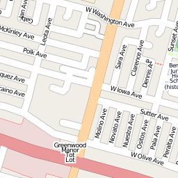
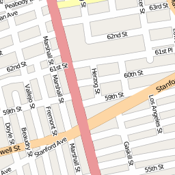
West of a small Silicon Valley downtown (94086), mix of single family and apartment buildings in Sunnyvale, California:
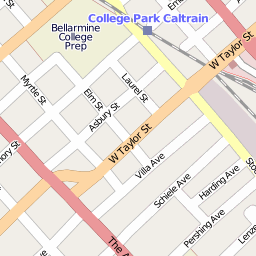
College Park (95126), mix of single family style homes, some subdivided, many turned into “compounds” with smaller units on same lot, west of downtown San Jose, California:
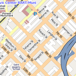
Western SOMA (94103), almost all multi-unit buildings in San Francisco:
Golden Gate district (94608), mostly subdivided victorians and later, some later apartment buildings in Oakland, California:
Unsurprisingly the second to last is probably my favorite location so far, though I’d prefer much higher density. I also wouldn’t mind more contrast, as Tim Lee’s post exhibits, and I’m sadly lacking non-U.S. locations (unless one counts a few months in Minabe, Japan, which isn’t covered well by OpenStreetMap yet).
Conveniently I seem to have lived nine places, making for a nice square:
Actually I omitted at least three — one or two places in Collinsville, Illinois and one in Springfield that I don’t remember at all (we moved to the first mapped above when I was three) and a dorm in Champaign, Illinois only a few blocks from the mapped location above.
I hope some other people in my feeds create posts like this for my eyes to enjoy. Jon Phillips’, for example, would have some great contrasts I bet.
I wonder if Tim got the idea of the book directly or from the post of Michael Surtees’ blog post called Living Patterns. (http://designnotes.info/?p=1242 ). When I read Michael’s one, I made my own living patterns at http://www.la-grange.net/2009/01/02/pochoirs-vie
The black and white is more work, but makes it a lot more visible about the density and the shape of the city. It also directly relates to this wonderful book called the image of the city by Kevin Lynch. A must read.
Karl, thanks for the leads!
I’ll have to attempt something in that b&w style and Lynch’s book is now on my reading list.
Subsequent readers, check out Karl’s post at http://www.la-grange.net/2009/01/02/pochoirs-vie for more contrast, both senses.
You could also plot your Walkscore over time. (http://walkscore.com/ – unfortunately based on proprietary data)
That looks like west of UIUC, unless they’ve moved it since 1981.
Anton, you’re right. Corrected above.
[…] bit of San Jose trivia, which I’ve meant to blog ever since I briefly lived there (2005): it is the largest suburb in the U.S. As of 2000 (I haven’t seen newer), it was […]
[…] July 12, there’s a big open streets event in my obscure flats neighborhood where Oakland, Emeryville, and Berkeley meet. A small stretch of San […]
Some code to create maps like some of above http://geoffboeing.com/2017/01/square-mile-street-network-visualization/